Special Premium Reco
May, 15 2013Chart of the week: Apple is trapped in a range
Last September, everyone, including the hotdog vendor, the shoeshine boy and the kitchen sink, was screaming that AAPL $1000 is just around the corner, and cartoon analysts named for state capitals were coming up with idiotic price targets (hint: $1111) that only intellectually-stunted dyslexics could love. Six months later, the former growth company (and now levered-dividend value play) can barely break above $300.
Even with the recent rally in its share price, there is a debate raging as to whether Apple is still buy now. It is now that the buy calls should be coming, not six months ago when the stock was at its all time highs.
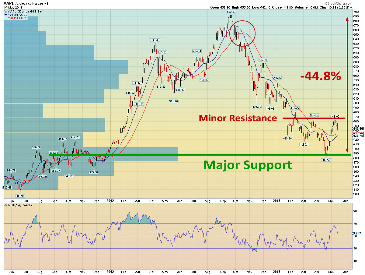
The chart below shows Apple’s price action over the past 2 years. The volume by price overlay on the y axis shows that in late 2011 a major battle took place between the bulls and bears, with the bulls eventually winning the day. This established the price area as logical support for Apple, and it is where the stock finally bounced after its seven month declined.
Also shown on the chart are the 20-day moving average (blue line), and the 45-day moving average (red line). When these simple overlays cross, as they did in October 2012 (circled), they can mark a major trend change, and this has proven to be the case with Apple.
Chart courtesy of stockcharts.com
Apple is temporarily trapped in a range, and to get anything going to the upside the stock needs to breakout decisively above $466. However, if such a move were to occur (particularly once it is accompanied by a moving average cross), it could be potentially very bullish for the stock which is already attracting both value and income investors.


